Chiang Mai
Logo

Competencies
- 🌸 Vector Illustration
- 🌸 Typography
- 🌸 Iconography
- 🌸 Illustrator
the challenge
What key elements make a city unique?
I was assigned to design a logo representing an international city, that was unique and not cliche.
the goal
Drawing inspiration from traditional art mediums
Design a logo that reflects an international city's artistic heritage, cultural richness, history, and modern vibrancy.
research & sketching
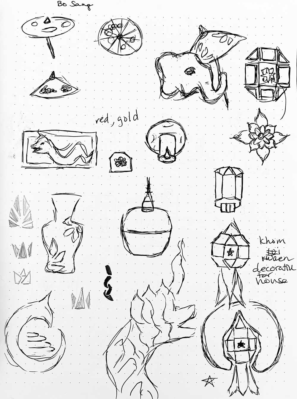
After identifying the categories I wanted to explore, I researched articles and looked at images. Watching YouTube videos of Chiang Mai provided me with a first-person perspective of what it would be like to visit the city. Key themes that I came across were: Chiang Mai's rich history in art; Naga, the mythological serpent river guardian; and local lantern festivals.
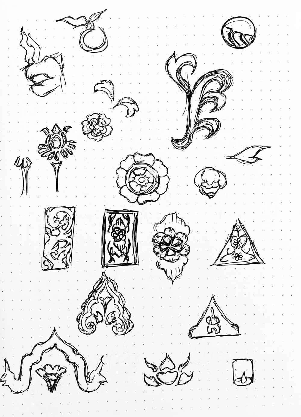
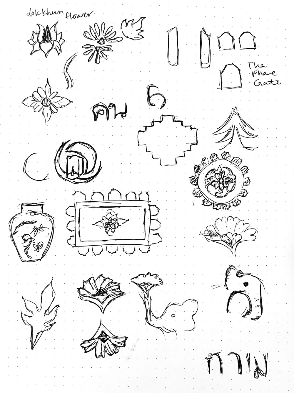
I started sketching and narrowed down my ideas until I had three viable concepts that could represent the city. I was really drawn to the intricate filigree motifs that constantly appeared in wood carvings around Chiang Mai. While it was challenging trying to incorporate them in my sketches, I kept fiddling around with it until I was satisfied.
conceptualization
I chose three concepts from my sketches that I felt strongly were unique to Chiang Mai's culture and traditions. After sharing three different logos and receiving feedback, I selected one to enhance and elaborate upon.
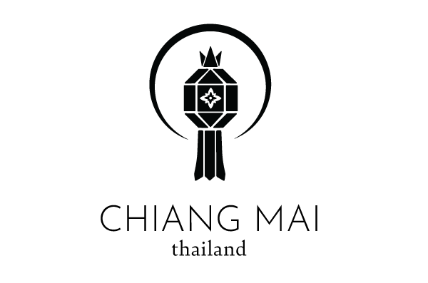
option 1 | lantern
Yi Peng is a famous festival that simultaneously marks the end of the monsoon season and brings good luck, and takes place during the full moon. Decorative lanterns, khom kwaen, are hung outside doors.
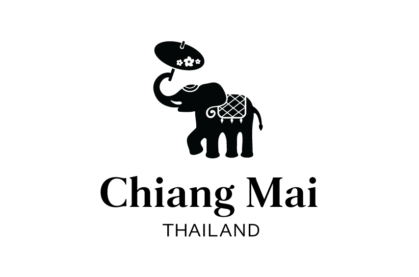
option 2 | elephant
Elephants are a common symbol of Thailand, and I adorned this elephant in decorations that mimic the ones on the Chiang Mai flag. The elephant is holding a paper umbrella, the bo sang, which is locally crafted in Chiang Mai.
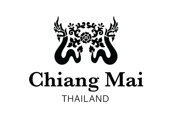
option 3 | naga
Statues of Naga can be found in Chiang Mai, and this mythological serpent is the river guardian spirit. The filigree pattern can be found in many temples and artwork around the city.
final logo
The final logo I chose was Naga with the rose and filigree details. Statues of Naga can be found along staircases leading to temples, and this also added nice symmetry to the logo. In the negative space, the filigree follows and flows with the organic curves of Naga. A rose in the center is a nod to Chiang Mai's nickname, "The Rose of the North."
The color palette reflects Naga's traditional colors and symbolizes Chiang Mai's lush fields. Deep greens represent the lush landscapes, while the vibrant pink rose creates contrast, and mirrors the local flowers seen in paintings and festivals. These elements create a visually striking logo deeply connected to Chiang Mai's cultural and natural beauty.
