The Waikiki
Aquarium
Redesign

Competencies
- 🌊 Photoshop
- 🌊 HTML/CSS/JS
- 🌊 UI/UX Design
- 🌊 Figma
the challenge
How can information be shared engagingly?
The Waikiki Aquarium, established in 1904 in Honolulu, Hawaii, is one of the oldest public aquariums in the U.S. The current website has dense, text-heavy sections and little visuals.
the goal
Incorporating visuals and attempting gsap
The objectives were to add in more vibrant images, while sharing information for both tourists and residents in a way that was appealing and digestible for audiences of all ages.
mapping
The first step was to analyze the current website and see what information could be consolidated to increase readability. I visited other national aquarium website's, in particular The Monterey Bay Aquarium, to prioritize key features that would need to be present in my redesign.
I concluded that condensing and combining text-heavy sections, and supplementing the information with outstanding visuals, was the best option for this project. I also wanted to make this site feasible to code, which is why I kept the sections minimal.

styling
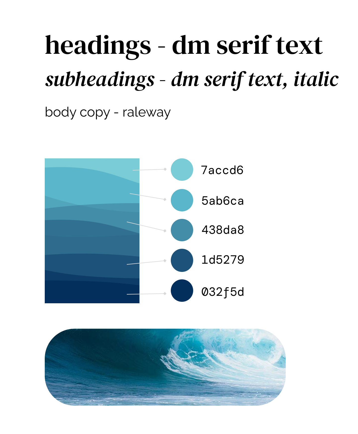
The next phase was to experiment with different colors and typefaces to bring my wireframe to life. I experimented with a couple of color palettes and typographic pairings that matched the feel of The Waikiki Aquarium.
typography
DM Serif was chosen for the headings and subheadings. The delicate serifs and ball terminals added a touch of elegance hinting towards type in scientific textbooks, fitting for an aquarium. For web use, I substituted with Libre Baskerville.
Raleway is a geometric sans-serif typeface, that balances DM Serif well with its more welcoming appearance. I felt this would be more suitable for heavier body copy, to make readability lighter for all audiences.
color
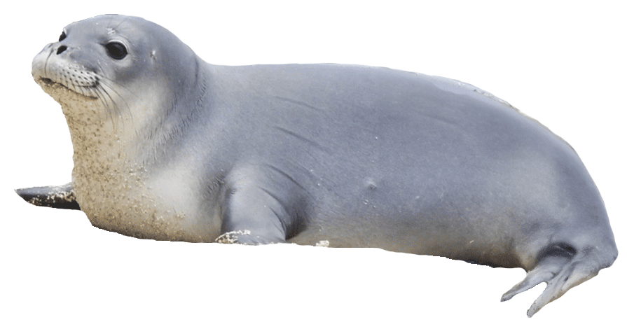
I wanted the website to mimic the beautiful ocean and habitat of the monk seal. Using Hawai'i's ocean as a reference, I chose a gradient of light to dark blues and created an organic wave graphic to incorporate in my design.


coding
With my color schemes and typefaces in mind, I set off on the adventure of coding my first website. From the start, I knew I wanted to incorporate parallax in my design. I found the perfect opportunity to add it in and used GSAP to bring my images of the Na Pali Coast to life.
I wanted the viewer to feel as if they were diving into the ocean, and immersing themself in Hawai'i's unique landscape. To add to the interactive element, I turned the images of the resident monk seals into animated gifs, using the puppet tool in Photoshop.