Patagonia Logo Redesign
Competencies
- 🌱 Vector Illustration
- 🌱 Typography
- 🌱 Iconography
- 🌱 Illustrator
the challenge
How can we honor the past while refreshing the present?
We were tasked with redesigning a current company's logo to be more longlasting and modern.
the goal
Hidden details that tell a deeper story
Research the company’s origins and values, then design a logo that honors its heritage and presents a modern identity.
research & sketching
I dug into the brand's past, studying its history and the founder's story. This helped me understand the brand's values and see what needed to be expressed through the logo. I delved deep into the past of Patagonia's founder, Yvon Chouinard, and all of his amazing accomplishments. I also researched some of the native wildlife of Patagonia.
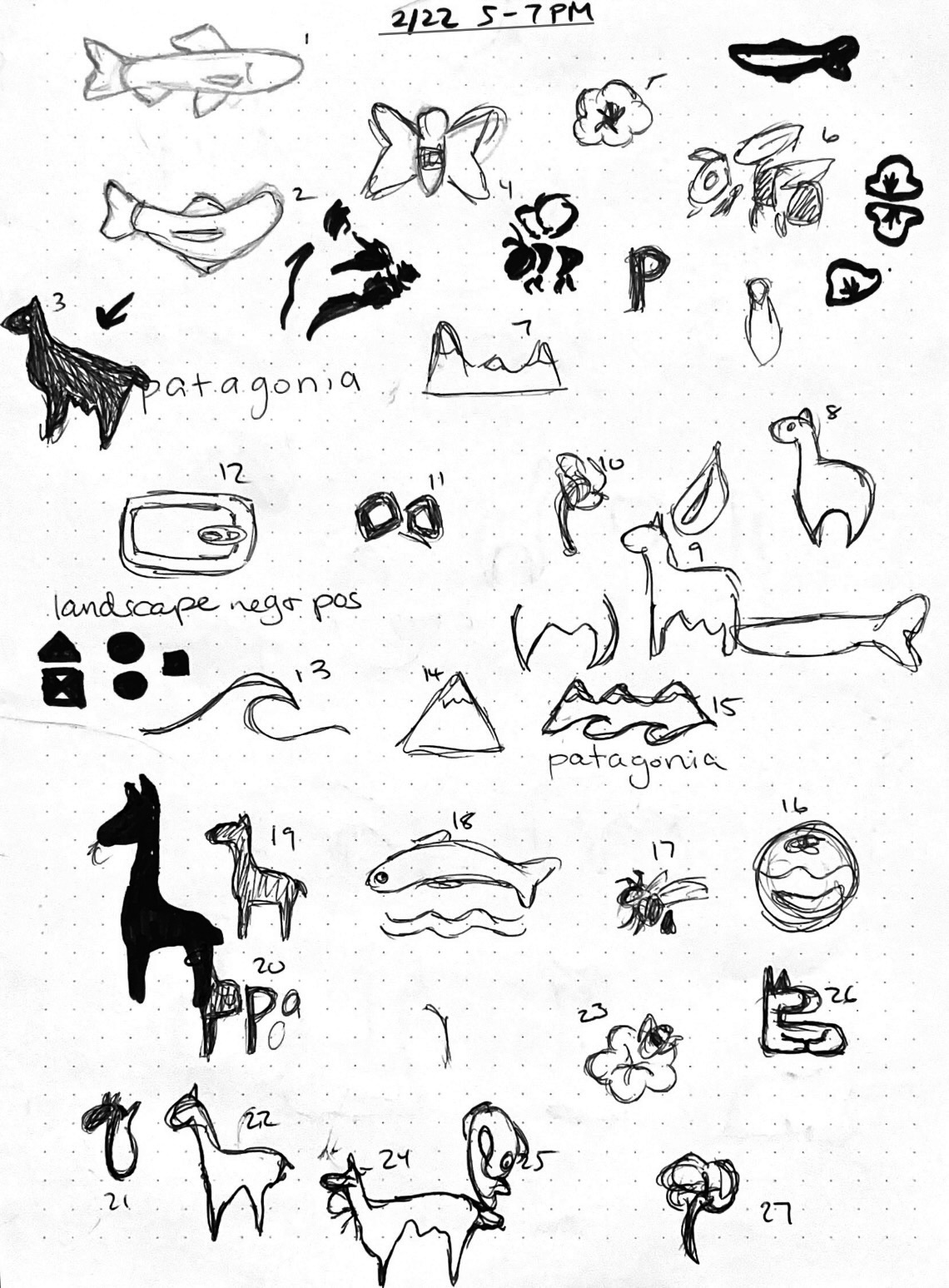
With the information I learned, I started sketching, but found myself feeling "boxed-in". My first round of sketches weren't quite hitting the mark, and required me to dive back into deeper research and produce a new round of sketches with fresh ideas. After hours of struggling to produce something I felt proud of, I finally had an epiphany: What if I tried playing with the negative shapes within the figures I was drawing?
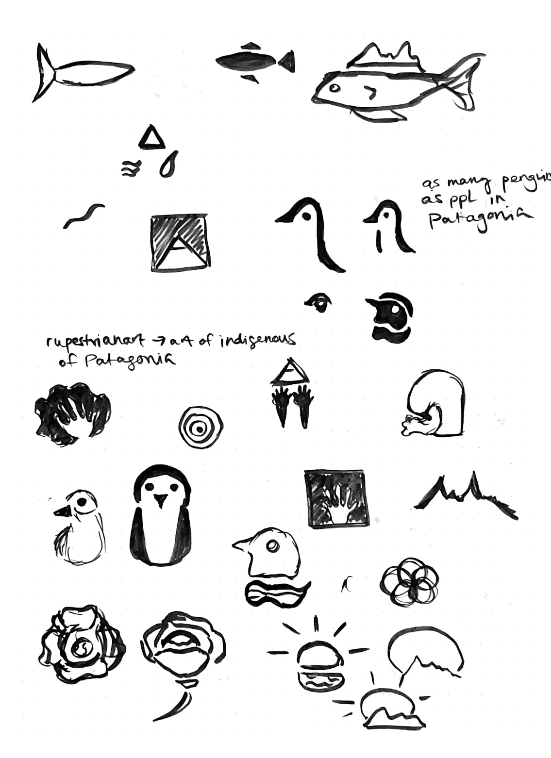
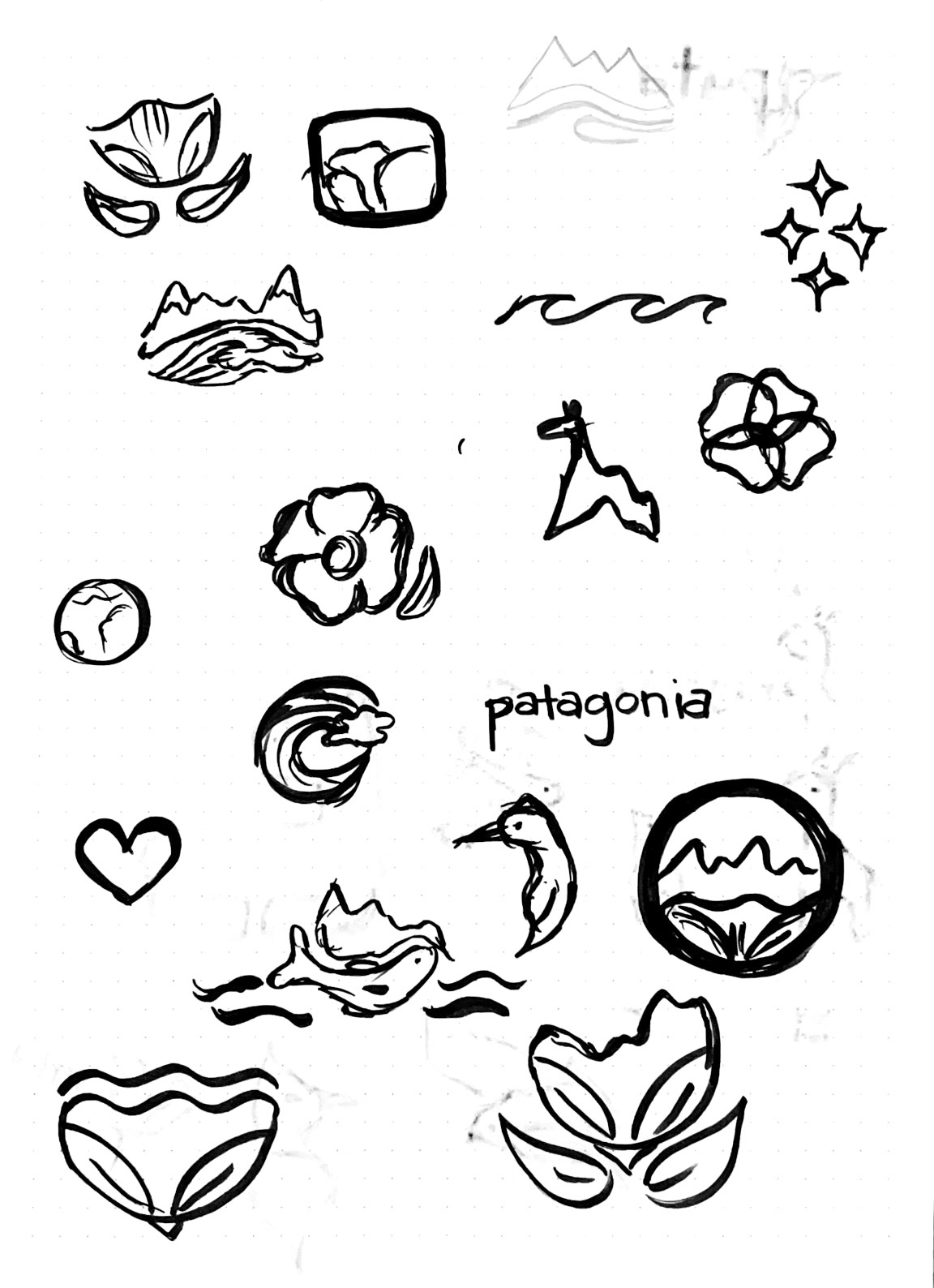
“How you climb a mountain is more important than reaching the top.” Yvon Chouinard
conceptualization
I chose three concepts from my sketches that I felt strongly represented the brand and were unique. After sharing three different logos and receiving feedback, I selected one to enhance and elaborate upon.
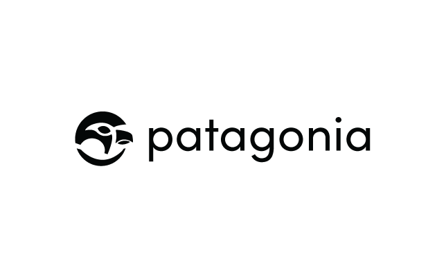
option 1 | falcon
In his youth, Chouinard was part of a falconry club; this led to his love of the outdoors. I selected a geometric sans-serif typeface to harmonize with and enhance the shape of the logo.
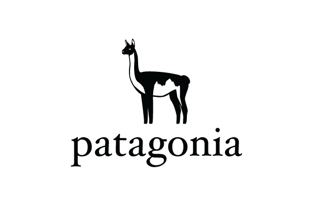
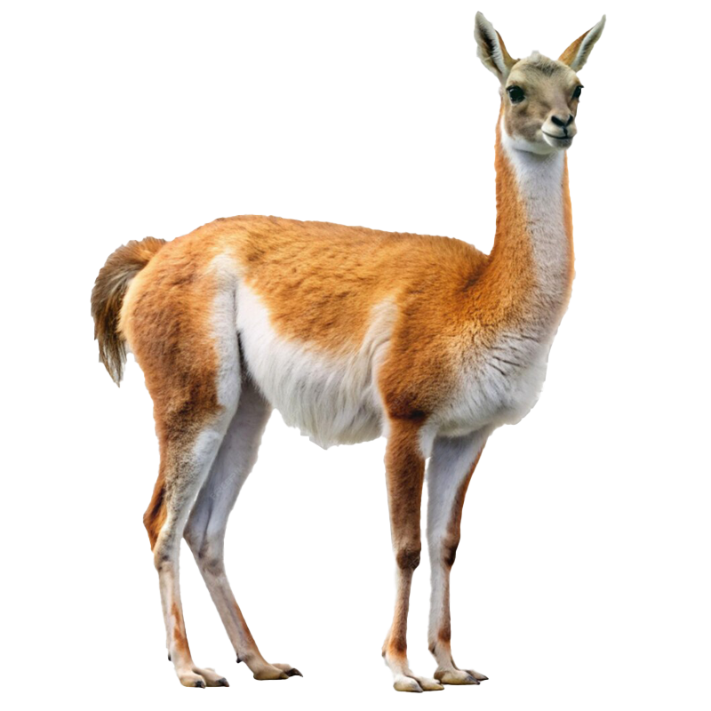
option 2 | guanaco
The guanaco is a native animal of Patagonia, and a key symbol in its ecosystem. The textures of the fur are arranged to show the silhouette of the Fitz Roy mountains.
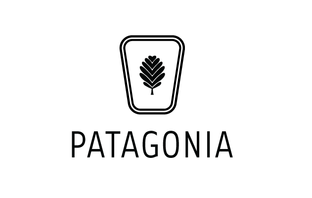
option 3 | chock
The chock is a nod to Chouinard's love of rock climbing and the brand's origin. The lenga leaf, a native plant to Patagonia, makes up the negative space.
iterations & final
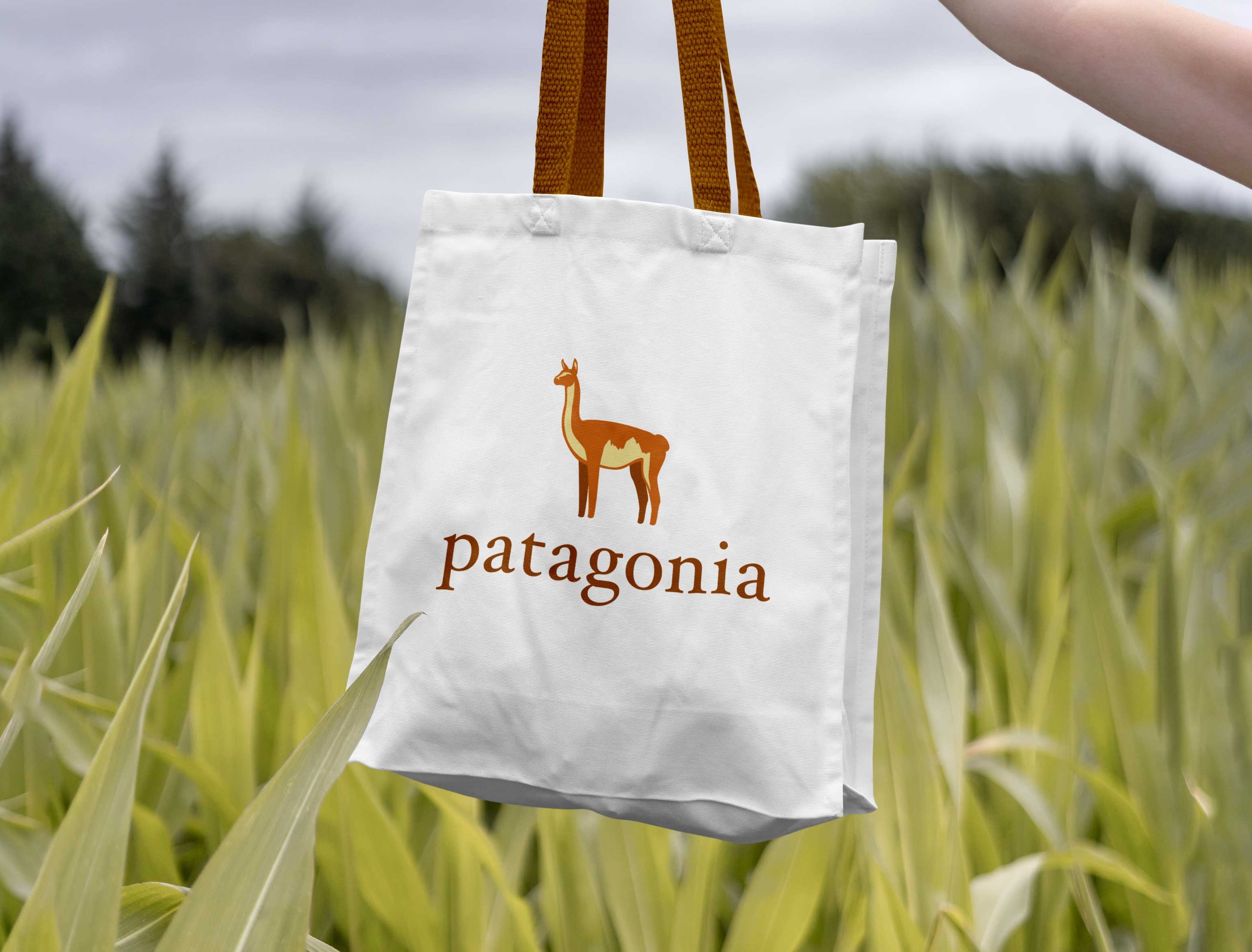
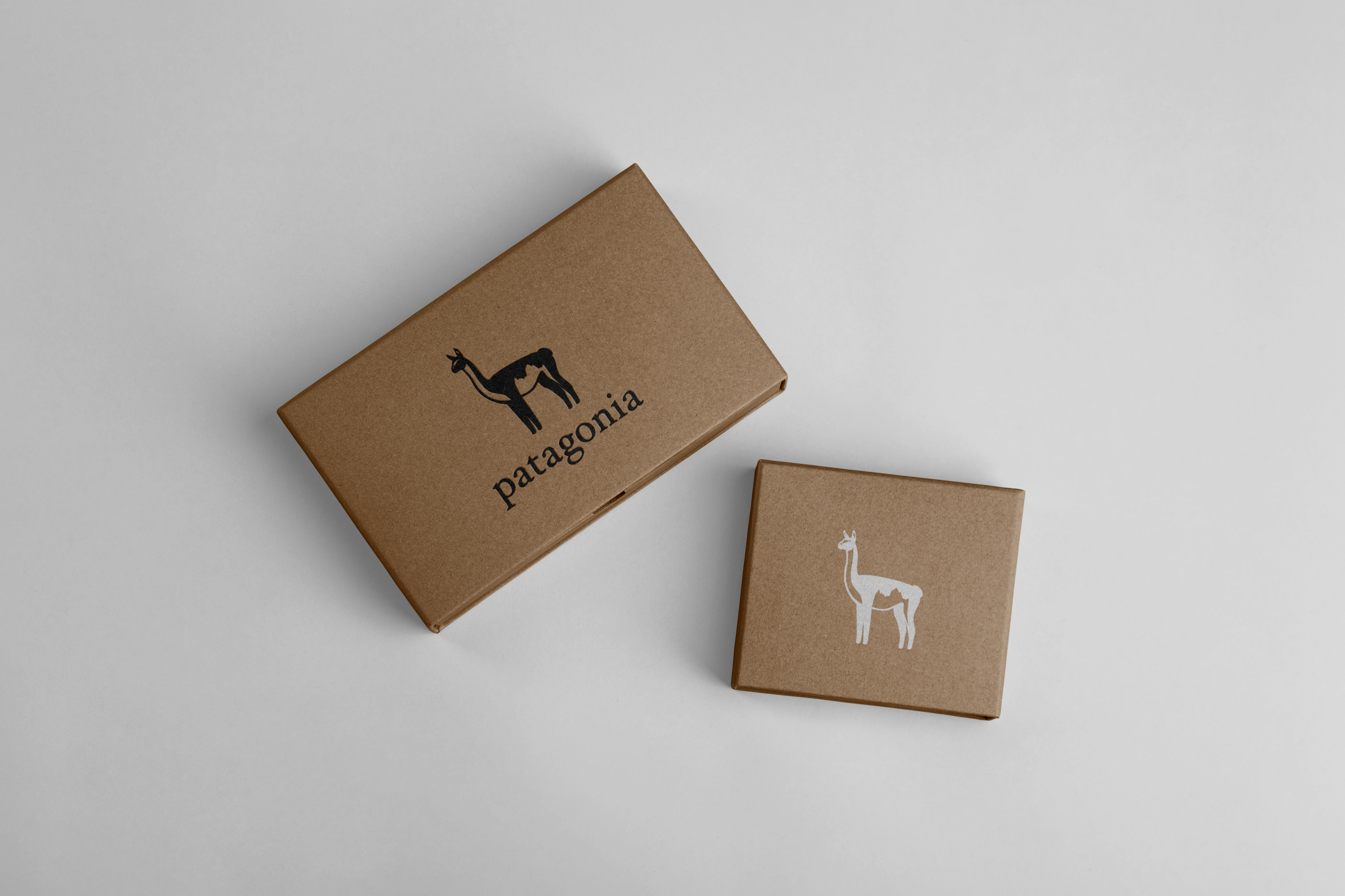
The final logo I chose was the guanaco. The only iteration I made was carving out light on the face of the guanaco, instead of using negative shapes for the eyes and nose. I felt this elevated the final look and tied everything in well.
I chose burnt oranges and pale yellows to mimic a realistic guanaco, adding warmth to the design reminiscent of a Fitz Roy sunset. The formal, classic composition of Hoefler, with its extended descenders, complemented the guanaco's legs.

