Plantoem
Redesign
Competencies
- 🪴 Photoshop
- 🪴 UI/UX Design
- 🪴 Figma
the challenge
How can I highlight and re-organize the content?
Plantoem, a local plant shop in Kaimuki, is not only a retail space but also a cafe and gathering venue. Currently, the information seems overwhelming and disorganized.
the goal
Auditing and consolidating information
I wanted to bring more attention on attributes that set Plantoem apart from other plant stores on the island. At the same time, it was important to consolidate information, so that the site could be easier to navigate.
mapping
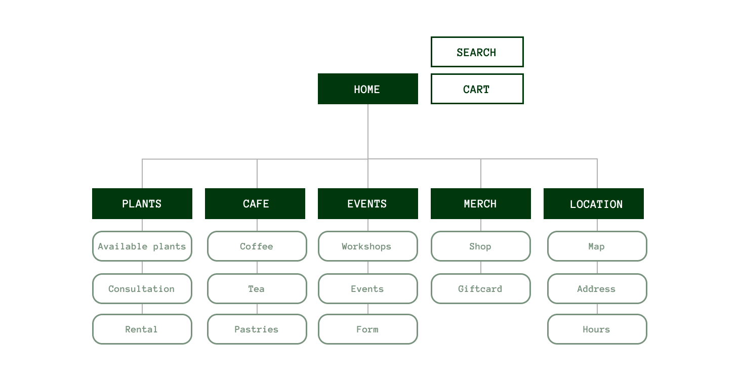
The first step was to do an in-depth review of the current information, and see what could be added or taken away. I researched other local and national plant retailers, to see if there were any trends or styles I could incorporate into my design.
I decided that I could reduce the number of subpages and put them into more general categories, so visitors would not need to excessively navigate the website. I also wanted to add in a subpage highlighting Plantoem's cafe, since it is such a charming space that is currently not being advertised on their website.
styling
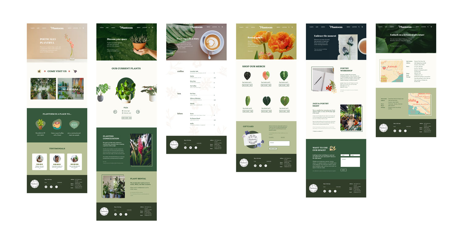
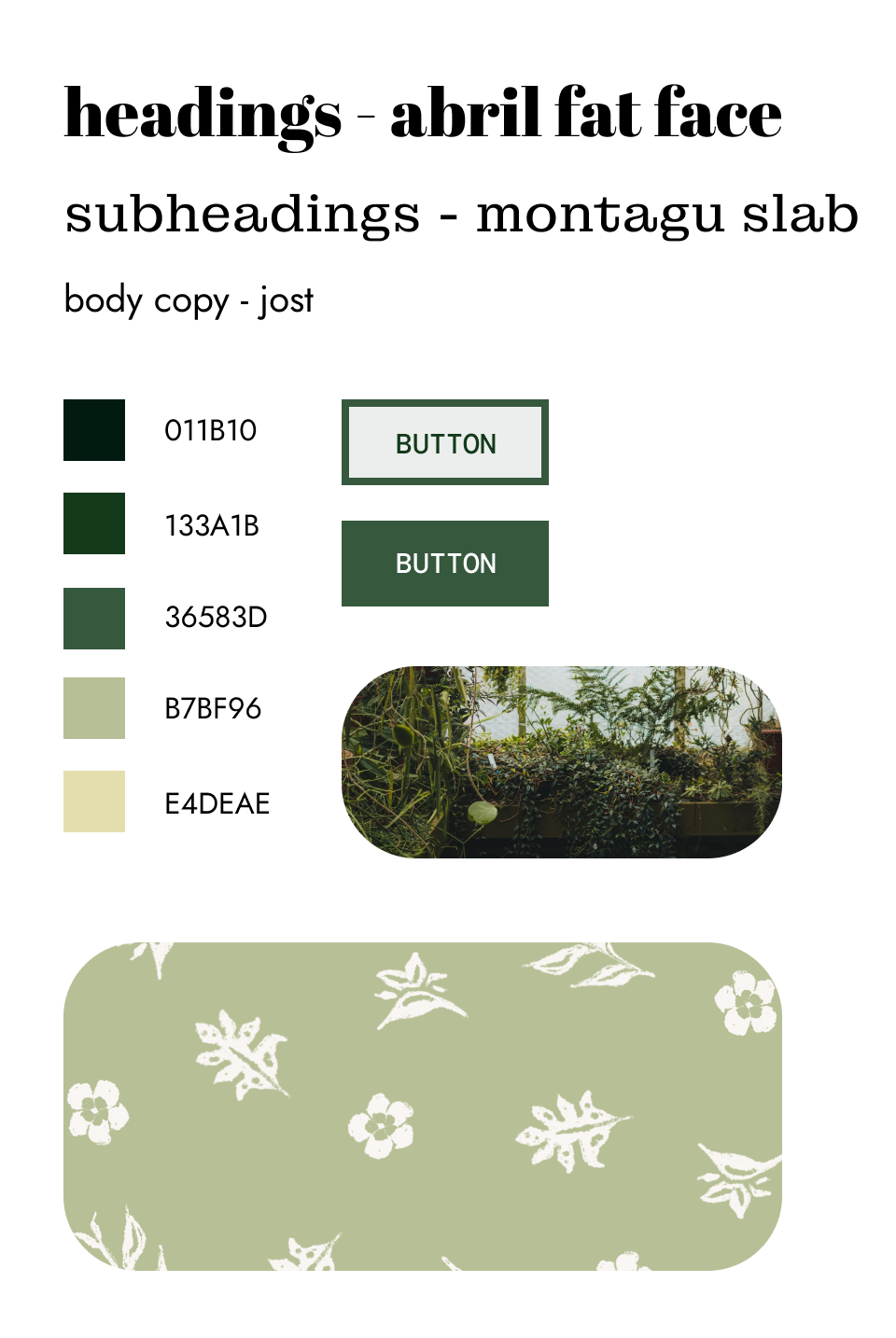
The next phase was to experiment with different colors and typefaces to bring my wireframe to life. I experimented with a couple of color palettes and typographic pairings that matched the feel of Plantoem.
typography
Abril was chosen for the headings. The slab serifs and ball terminals were fun, youthful, and eye-catching. Montagu Slab was used for the subheadings. Also a slab serif, it had subtle differences from Abril that helped differentiate sections while remaining cohesive. To contrast both of these serif typefaces, Jost, a sans-serif typeface, was used for the body copy.
color
The color scheme included shades of green to evoke the feeling of walking into a green room, complemented by earthy tones and pops of color for added contrast and vibrancy.
custom illustrations
I wanted to make some illustrations to put in the background of one of my pages. I drew some flowers and leaves in a simple, rough style to appeal to younger audiences and provide a warmer feel to the website. I ended up putting this illustration pattern in the background of the "cafe" page.
"Plantoem is a plant shop, a cafe, a community event center where you will find your connection with plants in different ways."
wireframing
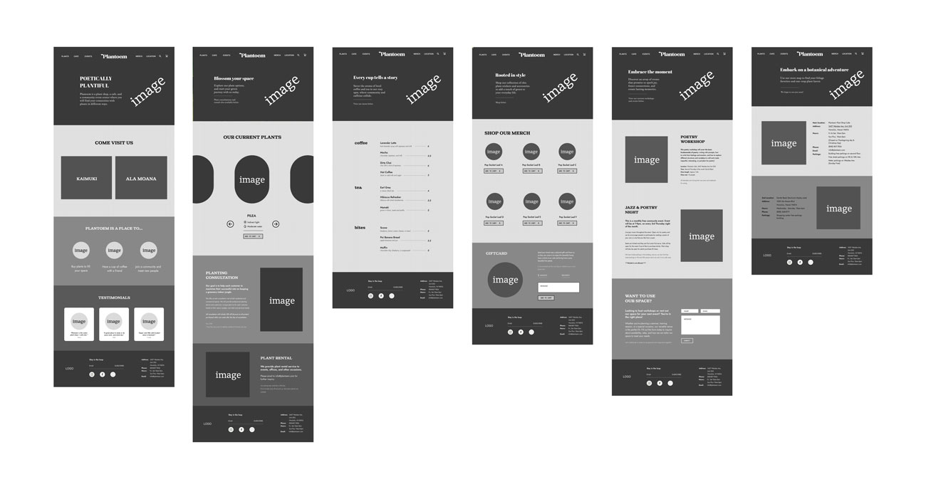
After finalizing my site map, typography, and color scheme, I constructed wireframes and added colors and imagery. I audited and reorganized the site's scattered content to make key information easily accessible. I chose high-quality hero images, enhancing them in Photoshop to align with the site's look.
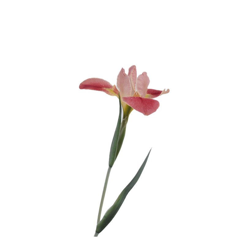
I used Photoshop to extract elements for accents across the site, maintaining visual consistency with unique touches. While the main color scheme was green, I introduced vibrant hero images to create a dynamic visual palette, improving both aesthetics and user experience.
