Editoral &
Layout Design
Competencies
- 📖 InDesign
- 📖 Photoshop
- 📖 Typography
the challenge
How can I convey information in a clear, engaging way?
I took my first class on typography, and it opened my eyes to how typographical layouts can affect how we digest information.
the goal
Exploring hierarchy, creating texture
Design magazine layouts that creatively blend color, typography, structure, and white space.
overview
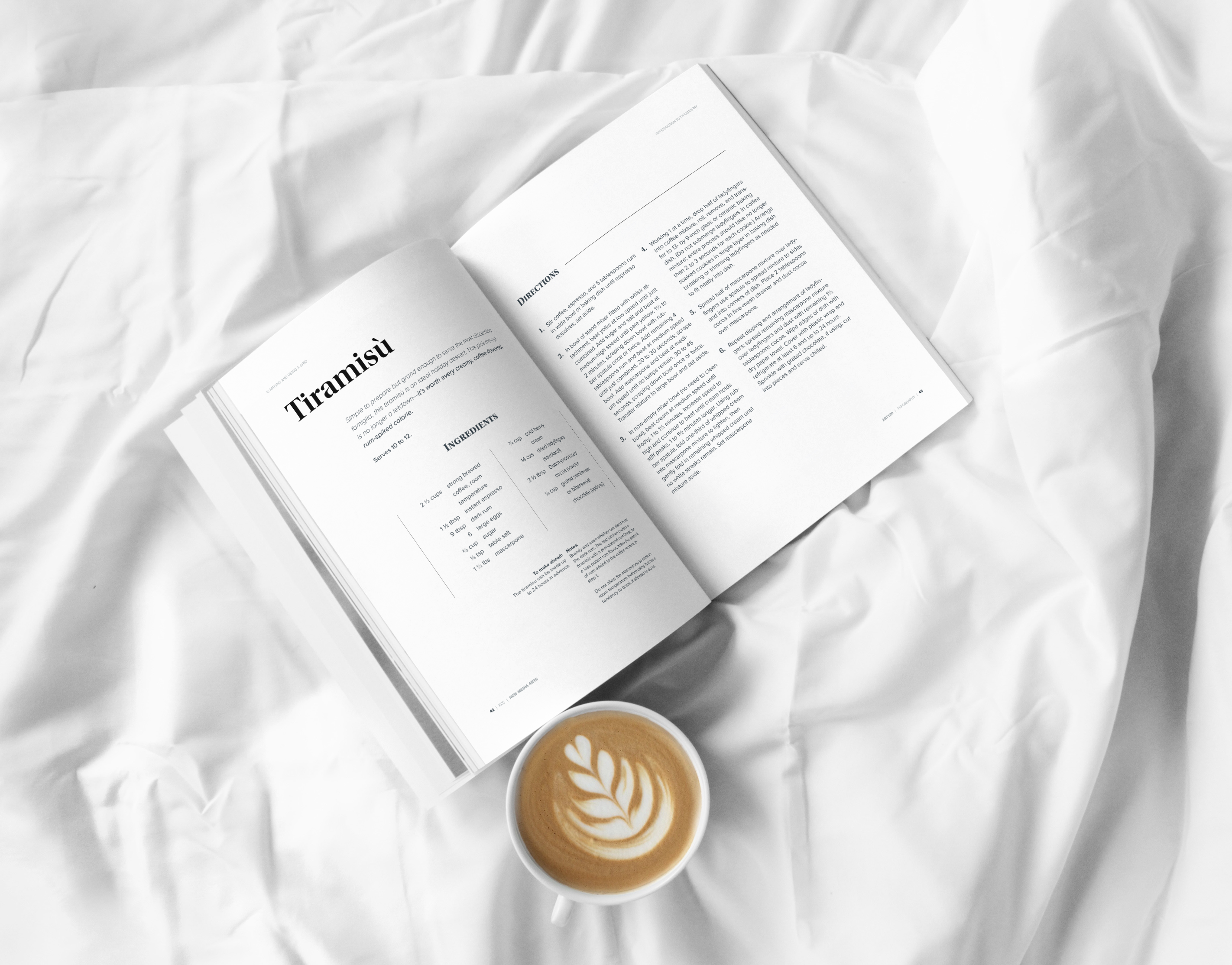
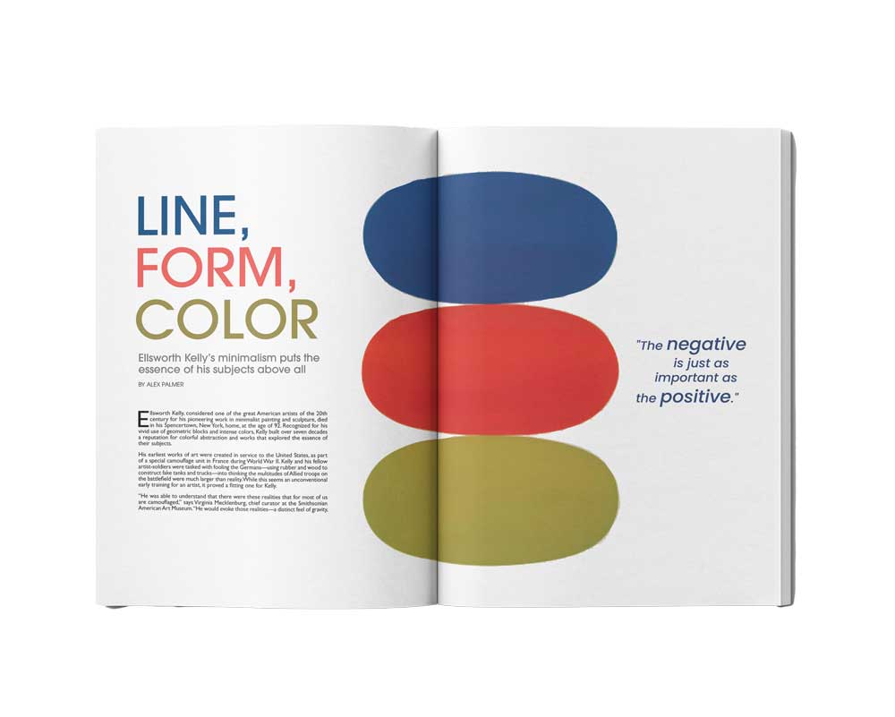
The main project in my typography class was to create a typography book. Below, I highlighted some of the work I created for that book. You can see magazine spreads that rely purely on pairing typefaces, balancing white space, and establishing text hierarchy, as well as pages incorporating images, where I learned to balance them with type to create layouts that are intriguing and exciting to read. It was a valuable experience that deepened my understanding of these concepts.
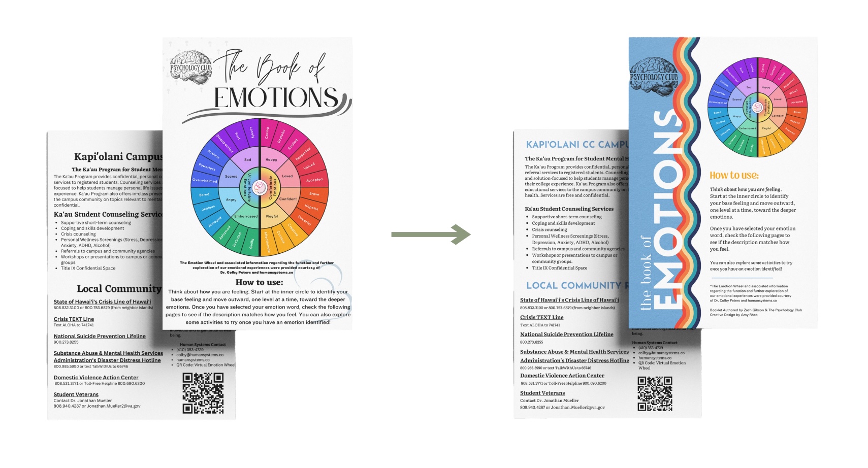
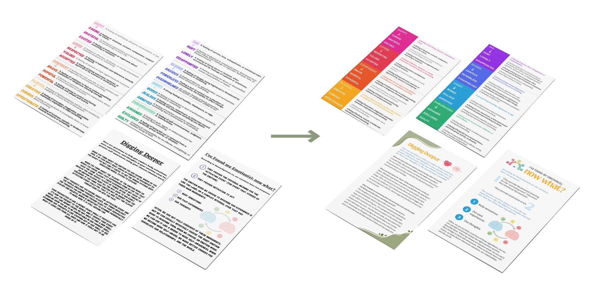
As a Layout Designer for the Board of Student Publications, I was assigned a design project for the Psychology Club's student journal, which would be distributed throughout the year. They provided me with a draft and asked for a more modern, eye-catching design. I incorporated more color, updated the typefaces for a refined look, and reorganized the text for better readability and navigation.


